Wednesday 30 November 2011

'NME' Magazine Statistics


The above to screenshots are from NME and Kerrang! Magazine. They show the demographic information.
The ABC1 for NME is 73% and Kerrang!'s is 52%. This shows how NME is read by the larger percent of people form the upper profile compared to Kerrang! Which is just over 50%. This could lead to why the mean age being 25 in NME and just 22 in Kerrang!

'The Source' Magazine Statistics

This is another screen shot of some statistics from the magazine 'The Source'. These statistics show the readership and various things which tell us about the magazine. For example, the median age of people who read the magazine is: 28 years old. People who read the magazine are predominantly male at 58% to 42% female.

Tuesday 29 November 2011

'The Source' Magazine Statistics

These show some statistics from the magazine: The Source. The statistics show the prices that vary depending on what the artist does in the magazine.

Tuesday 22 November 2011

Article Research


This is an article with the band 'The Teenagers' in NME magazine. As NME is a music magazine, this gives me an idea of how a double page spread could be layed out and what type of article I could write for my music magazine.


Planning Production

Possible Front Cover Images -
I chose these three images as possible main cover star images because the top two have the star looking directly at the camera which is good as this is typically seen in competing magazines. The bottom image therefore challenges that convention however the image is still usable. All three would need to be cropped and made larger to become medium close- ups. 

Possible Contents page images -

The first image would be zoomed in due to the original medium long shot image. The second would be fine as it is already a medium close up image. I chose these two images as in both the artist is looking at the camera which is

Possible Images for Double Page Spread -

I chose these images as they all show the star in a different way. The first shows the funny side to her, she's joking around and posing. The second shows her just generally being happy and smiling, the third is an extreme close up which shows her looking more serious. All images would be suitable as they each represent her in a different way.

Sunday 20 November 2011

Questionnaire

1. What type of music magazines do you like to buy?
   
    ---------------------------------------------------------------------------
2. How often do you buy a music magazine?

    ---------------------------------------------------------------------------
3. Which colours do you like most?

    ---------------------------------------------------------------------------
4. How much are you willing to pay for a magazine?

   1-2                  3-4                 5-6                7+

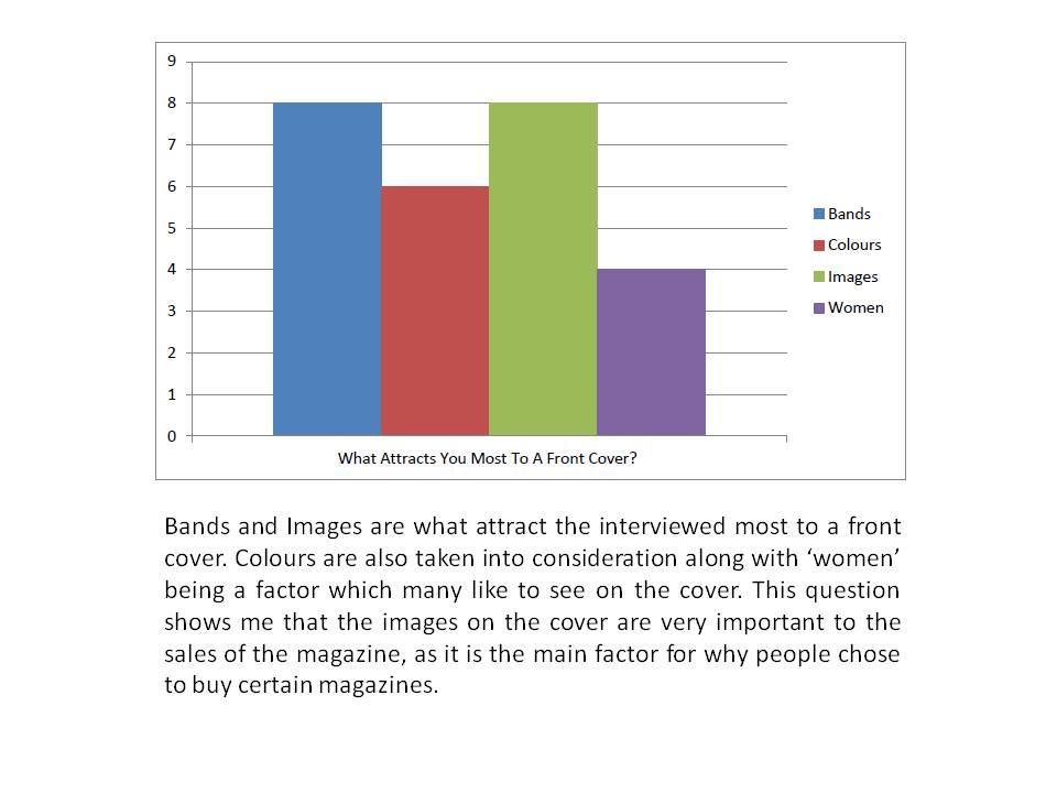
5. What attracts you most to a front cover?

    ---------------------------------------------------------------------------
6. What don't you like about the current magazine covers on sale?

    ---------------------------------------------------------------------------
7. What puts you off buying a magazine?

    ---------------------------------------------------------------------------
8. Do offers entice you to buy a magazine more?

            Yes                              No

9. Which type of music do you like most?

     --------------------------------------------------------------------------
10. Would you rather buy a magazine which included various types of music rather than just one?

     --------------------------------------------------------------------------
11. If no, which type would you prefer?

      --------------------------------------------------------------------------
12. Who is/are your favourite artist(s)?

      --------------------------------------------------------------------------

Questionnaire Video's

Double Page Analysis 3

The colour scheme of the spread is black, white and red. These colours may have been chosen because of the shirt the main feature image has on. The layout is simple, the main feature image is located on the right side of the page, covering most of it, a small part of the image (the elbow) stretches over the left page. The header is a pull quote, in an almost ransom note style font, this would most likely be off a website like ‘DaFont’. The text is white lettering with black rectangles behind them. It fills three quarters of the left page, also slightly stretching onto the right page. The kicker is in a simple sans serif black font, except for the main feature artist’s name: ‘Lily Allen’. The main feature text is only a tad smaller than the main feature text. The main feature text begins with a drop cap which is a very bold sans serif letter. It is then in four columns. There is also the page number and some additional information in small font. I think the ransom style lettering is chosen because the image of the artist and the header give the impression that she is more of a rebel and people seem to think she is maybe a bit of a trouble maker or attention seeker and as shown in the image, she has dark eye make- up on and has her hands on her hips whilst she is slightly leaning forward towards the camera. This also gives the impression that she is almost leaning towards the camera as if she is getting closer to the reader and letting them into her world.
Using Photoshop this double page spread could be made using a range of tools. Firstly, the background could be made by using the shape tool to create a rectangular shape which filled the page size, this background is either white or a light grey, so to change the colour of the shape you simply click on ‘FX’ then ‘colour overlay’. Although the image does look as if the background could just be the background in the actual image. Next, once the image has been brought into Photoshop, the ‘magic wand’ tool could be used by selecting the background to the image of the feature star, then by pressing delete, the main feature image would be left. However, by using this method, other similar coloured areas within the main feature image may be deleted also. So, to use ‘Magnetic Lasso’ may be better because it would delete the whole background in one, leaving what you want to leave. The header don’t would be probably off a website like ‘DaFont’ Once the font: ‘PEOPLE THINK I’M AN ATTENTION SEEKER, BUT I’M JUST BEING HONEST’ is placed on the page, using ‘magic wand’ to select the letters, then press ‘options’ and select ‘Inverse’ and then pressing ‘delete’ everything around the letters would be deleted except for the letters. The same could be done for the drop cap ‘I’ letter. The rest of the text could be made simply using the text tool. Also, by using ‘Ctrl’ and ‘T’ the size and angle of the shapes or text can be changed.
The magazine uses a low register when addressing the audience.

Double Page Analysis 2

The colours scheme is the classic red, white and black. The layout is a more chaotic than the usual spreads as there is the main feature image, filler images, the main body text, side bar and text, category text, captions on the images, kicker and so on. The main feature image rests on the left side of the page, like all of the images on the page; it is in black and white although look slightly sepia. The image is of the lead singer in the band, it looks like an action shot of him during a performance as he is holding the microphone and looking down almost in motion. The artist is presented to the audience as a band which cares about the music. Just above it is the category and web address which are in a black rectangular box which has a thin white stroke around the edge. Then to the right it says: ‘World Exclusive’ in another rectangular box, with a triangle shape on the end, so that it looks like an arrow. To the right of this, at the top of the right page is the header, which is a pull quote from the interview. The main header text is in three lines, the first and last being in red, and the middle in white. There is also an effect to the text as there are cracks running through the letters. Underneath this is the kicker, this begins with the band’s name: ‘My Chemical Romance’ this part of the text is in bold, the rest is normal, all is a plain sans serif white font in capitals. Below this and above the filler images is the main text which is all also in white, apart from the drop cap which is in red. There are three filler images which are below the main text. These stretch from the bottom right hand corner to just near halfway of the left page. These images consist of the rest of the band. Each image has a thin stroke line around the edge, this helps to make the images bolder against the background. All of the fonts are bold and sans serif. Each image has a caption to inform what the image is about. All the way down the side of the right page from the top of the page to the top of one of the images is the side bar. Within the side bar is another shape, almost like another arrow. This shape is red, whilst the larger outside shape is white. The text throughout both shapes is red, white and black. Simple lines are used to section the different text within the shape; also sub- headings are used. The main text is in two small columns in white.
Using Photoshop this double page spread could be made using a range of tools. Firstly, the main feature image can be brought into Photoshop. As it looks like the background of the image is still there, nothing has been done to it. Although, the right page is just black, so this could be done using the shape tool to create a shape the same size as the page, then by clicking ‘FX’ and ‘colour overlay’ the shape’s colour could be changed. The large font for ‘WE’RE BEING THE BEST MCR WE CAN BE!’ would most likely be off a website like ‘DaFont’. It would be brought into Photoshop then using ‘magic wand’ to select the letters, and pressing  ‘options’ then selecting ‘Inverse’ and then pressing ‘delete’ everything around the letters would be deleted except for the letters. The same could be done for the drop cap ‘M’ letter. The rest of the text could be made simply using the text tool. The little stars which are seen in two different areas on the page could be made simply using the ‘shape’ tool, then copy and paste so that the shapes size would stay the same for all stars.

Double Page Analysis 1


The colour scheme is basic, consisting of just red, white, grey, black and blue. The main feature star is sat on a box draped in red and white stripes. She is in a black dress and heels and is sat on the edge of the box with her left hand on the box, her right resting on her left knee then her left leg bent placed on the step her right leg touching the floor. The mis- en- scene gives the impression of Florence Welch being a less than innocent character as black is associated with darkness and bad things; something which is the opposite to good. So it is presenting that the article is showing a different side to the cover star.
The background is white and there is text ‘USA’ behind her in grey, it is a bold, sans serif font. There is then some black lettering in a serif font which says ‘got the love’. This is most likely in reference to one of the feature star’s most known songs: ‘You’ve got the love’. As it is placed just slightly over the other text, ‘USA’, it could be to say: ‘USA got the love’, as we can see the red and white striped material is what the feature star is sat on and her name is in a blue font. As we know the American flag has the red stripes and blue stars. So I think that could be linked to the ‘USA’ text. This could also be a connotation. The layout is quite simplistic; as there is the main feature image of the artist on the left of the page which takes over most of it, the image slightly comes over to the right side of the page. I think this could because the article is treated like it is on one page, so the text and feature image spreads over both pages. The kicker is a sans serif font, all the text is black except for ‘Florence Welch’, which is in blue, which again links to the USA connotation. The main body text is again in a simple text, with a black font, but the text begins with a ‘drop cap’ which is the large letter that begins the first word, in the first sentence. The drop cap is in a large, bold, serif font. This text is in three columns.
Using Photoshop this double page spread could be made using a range of tools. Firstly, the background could be made by using the shape tool to create a rectangular shape which filled the page size, then using the gradient tool to create a vertically fading grey to white background. Next, once the image has been brought into Photoshop, the ‘magic wand’ tool could be used by selecting the background to the image of the feature star, then by pressing delete, the main feature image would be left. However, by using this method, other similar coloured areas within the main feature image may be deleted also. So, to use ‘Magnetic Lasso’ may be better because it would delete the whole background in one, leaving what you want to leave. The large font for ‘USA’ may have already of been in the background of the main feature star image, if it was, then using the magnetic lasso tool, you could keep it on the same layer as the main image. If it has been placed on the page separately then either by using a website like ‘DaFont’ or just the ‘text’ tool on Photoshop and using a simple font like ‘Tahoma’ in capitals, ‘USA’ could be made. ‘Got the love’ has the same options as the latter font. If ‘got the love’ or ‘USA’ were from DaFont then once onto the page, using ‘magic wand’ to select the letters, then press ‘options’ and select ‘Inverse’ and then pressing ‘delete’ everything around the letters would be deleted except for the letters. The same could be done for the fancy drop cap ‘D’ letter. The rest of the text could be made simply using the text tool.
The language/tone used when addressing the reader is formal. This represents the magazine as its abc1 is 73% which could relate to why the magazine is written more formally than possibly Kerrang! Which only has an ABC1 profile of 52% and so would probably be written more informally on a lower register.  

Researching The Market Place

This table shows the comparisons between three different magazines. By looking at this, you are able to compare the prices, frequency of publication , issue size and so on.

Analysis of Professional Contents Pages

Main Task - Initial Ideas

This spider diagram gives an idea of who my target audience are and what type of music magazine I am going to produce.

Professional Magazine Cover Analysis


Evaluation Of College Magazine Contents Page

Evaluation of Contents Page
Firstly I made a list of conventions which featured in various magazines. These are things such as: ‘contents’ as a title, a list of page numbers with little or a lot of information on what that page feature and a large image which is the main focus of that page. I then looked at the different layout and compositions which were used. This helped me to be able to plan and organise ideas for my magazines contents page.
Next, I began to make my contents page. Using Photoshop, I used tools such as: ‘Text’, ‘shape’ ‘Magnetic Lasso’ and ‘Magic Wand’. Using magic wand, I would simply click on to the tool, them selecting an area of the image that no longer needed, I would press ‘delete’ to get rid of the selected area. Although, by using the ‘magnetic lasso’ tool the same result could be reached, easier if not better. So, using this tool I basically began at one edge of the image then carried on around the edge of the head and body in the image, clicking at various points, around the edge of the image so that it is easier to get around every corner of the body. Then connecting the last point with the first point, then pressing ‘delete’ to get rid of the outer area. For the main image on the contents page, I used a bright professional camera light to brighten the image whilst I took the picture.
If I were to do this again, I would probably not change that much as overall I think it went quite well. However, I would try to complete the assignment at a faster pace, therefore having more time to change things at the end if I needed to. I would also then try to make the magazine look as professional as I could, sticking to a type of presentation, which represented the type of magazine I was making, well.

Evaluation Of College Magazine Front Cover

Evaluation of Front Cover
Firstly we researched various magazines and identified the conventional elements which appear in all magazines. These included things such as, a mast head, a main cover star and story, puffs, bold text, smaller story information around the sides, and so on. So from this; we could sketch out a magazine which featured the conventional elements and sketches of Magazine title ideas. I then began to make my magazine on Photoshop.
I began by choosing a font which I thought suited the college magazine most and looked slightly like the sketches I did previously. I chose this font from ‘DaFont’ and then print screened it and pasted it onto my Photoshop page. I then used the wizard tool to select the text, and then selected ‘inverse’ and ‘delete’. This means the outside of the selected would then be deleted. I then used various other tools such as ‘shape’ to create shapes to go behind the text so that it would stand out over the background image etc. To change the colour of the shape I would use ‘colour overlay’. For the rest of the fonts I used the ‘text’ tool. I created the mast head by the same method of the other shapes.
If I were to do this again, I would probably try to make the magazine look more professional. I think this could be done by the magazine’s layout being filled out more as some parts look bare. Also, the background looks quite bare, so I think that could have maybe a burred image of a college building, just so the magazine looked more complete. As at first, I had used the shape tool and colour overlay to create a light grey background. However, this didn’t look right, as it made the magazine look dull, so I decided on a plainer, white background.